
SIMA
A Brand Reborn, A Website Worthy of It
SIMA came to us with a new brand identity and a clear challenge: build a website that carries their visual language while making sense of a complex portfolio of specialty risk services. They needed something that felt authoritative and immediately clear to the right audience.





The Challenge of Clarity in a Complex Industry
SIMA operates across four service lines (MGA, Intermediary, Advisory, and Ancillary), each serving different client needs within the specialty risk and reinsurance space. A website that tries to explain everything at once tends to explain nothing. Our job was to bring order to this: give each service line its own space and voice, while keeping the overall experience easy to navigate.
Add to that a new brand identity that needed to be expressed digitally, not just applied, and you have a project that demanded as much care in strategy as in execution.
Elegant by Intention
The brief was clear: elegant, minimal, and professional, but with the brand actively present throughout the design, not reduced to a logo in the corner. SIMA's brand is built around the swan, a symbol of grace and precision. We wove that into the site itself.
The swan appears as a ghosted watermark in key sections, adding depth without demanding attention. In the navigation overlay, a bold swan graphic sets the tone the moment a user opens the menu. In the CTA section, a second swan composition anchors the call to action with the quiet confidence that defines the brand.
Hero section showing the glow effect and dark palette
Section showing the swan watermark in context
CTA section with swan graphic
Products grid
Global Presence
Hero section showing the glow effect and dark palette
Products grid
Section showing the swan watermark in context
CTA section with swan graphic
Global Presence
Dark, Glowing, and Distinctly SIMA
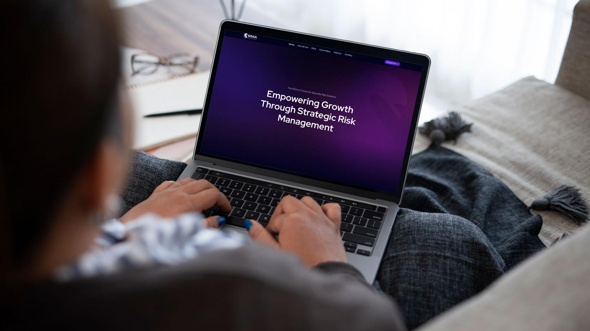
We chose a dark palette: a deep near-black background with rich purples and electric gradients. This doesn’t look like a typical insurance website, and that’s intentional. The visual language tells you who SIMA is before a single word is read.
Soft glow effects throughout the site add depth, kept subtle enough not to be distracting. Every visual decision points in the same direction: SIMA is not ordinary.
Four Services, One Coherent Experience
SIMA’s core business is as an MGA (Managing General Agent), providing specialised underwriting for complex risks. Alongside that, they offer Intermediary placements, Advisory strategy, and Ancillary services including 24/7 medical support and claims handling. These are genuinely different offerings, for different clients in different situations.
We structured the site around this. Each service line has dedicated pages with enough room to cover products, use cases, and capabilities in detail, without bleeding into the others. The navigation makes the distinctions clear from the start, so visitors can find what they need without confusion.
The MGA services sit at the heart of the experience, with individual product sub-pages letting SIMA showcase each specialty offering in full detail. The other service lines are peers in the navigation, not afterthoughts.
Precision in Motion
We used GSAP and ScrollTrigger to build scroll-triggered animations that feel native to the site’s tone: precise, deliberate, and never overdone. As sections enter the viewport, images scale gently into place while text and content elements rise and fade in with a stagger that feels organic rather than mechanical.
The result is a site that feels alive without feeling busy. Every animation reinforces the sense that something deliberate is happening.
The Power of Astro: Built for a Global Audience
SIMA’s audience is global, operating across MENA, GCC, and ASEAN. Their clients are senior professionals who expect fast, reliable pages. We built the site on Astro, a framework that generates static pages with near-zero JavaScript overhead.
The result loads fast everywhere, is highly secure, and handles growth without additional complexity.
Sanity CMS: Content in the Right Hands
With Sanity as the CMS backbone, SIMA’s team can manage every page, every service description, and every product detail, without touching a line of code. The system is structured to reflect how SIMA actually thinks about their content: by service line, by product, by audience.
This is a website built to grow with the business. When SIMA adds a new product or updates a service offering, their team can do it independently, quickly, and confidently.
A Platform Built to Last
The SIMA website represents the brand clearly, works well for the people it’s built for, and gives the team the tools to keep it current.
We’re happy with how this one came together. The foundation is solid, and SIMA is well placed to build on it.


Highlights & Results
From a bold visual identity to a structured CMS built to grow with the business, here are the key elements that define the SIMA website

Dark-Mode, Premium Design
A deliberate dark palette: deep near-black, rich purples, and electric gradients, with soft glow effects that add depth without overdoing it. A website that looks nothing like insurance.

Sanity CMS: Content in the Right Hands
A structured CMS tailored to SIMA's team lets them manage every page, service, and product detail independently, without touching a line of code. Built to grow with the business.

Built with Astro
Astro’s performance-first framework ensures fast load times worldwide, with near-zero JavaScript overhead. The right choice for a global audience that expects professional, reliable performance.

Smooth Animations
Scroll-triggered animations using GSAP and ScrollTrigger feel deliberate and native to the site's tone: precise, considered, and never overdone. The site feels alive without ever feeling busy.
Other projects
Summit Business School




Online business school website with Stripe payments, subtle animations, and flexible forms/landing pages creation. Used Astro to ensure great performance and ease of development.
Brendan Kane

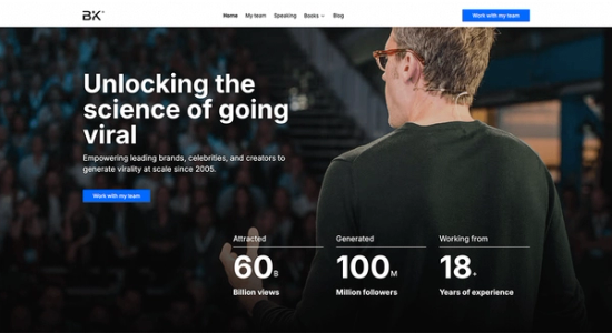
Astro website for Hook Point's CEO Brendan Kane. Re-used content from Hook Point's CMS on some pages for easier updates.
Lightlab

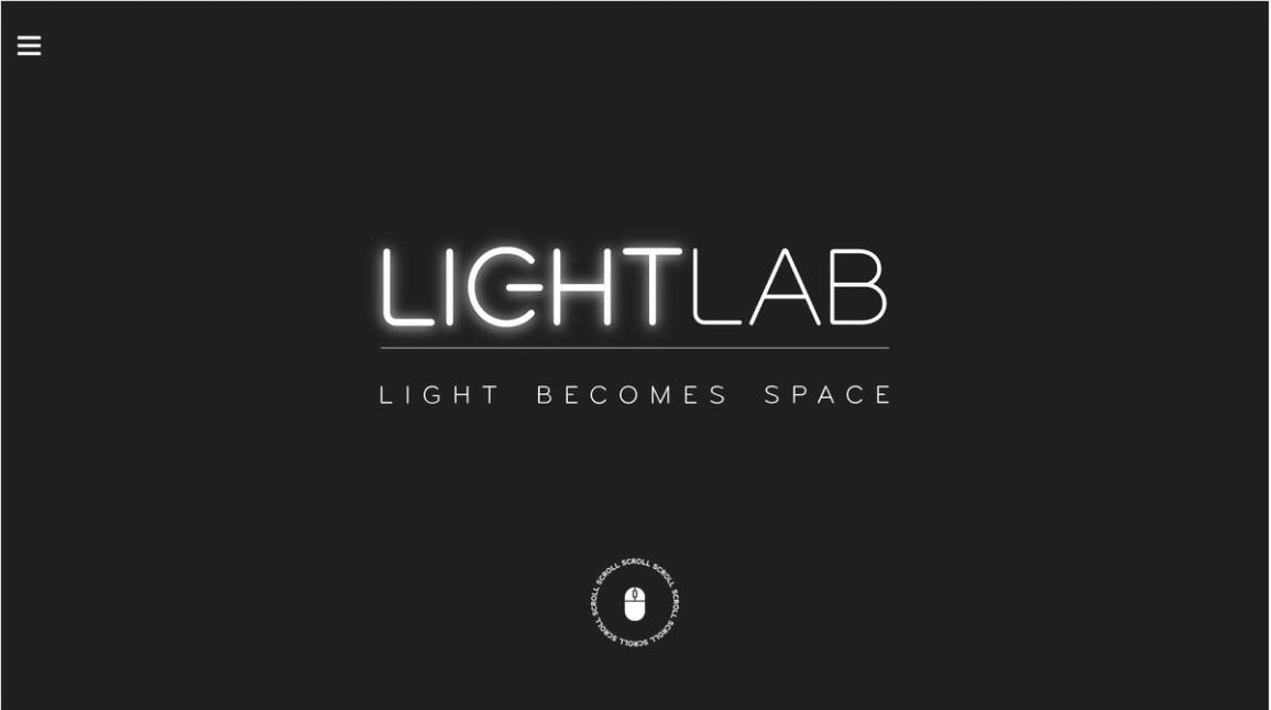


Landing page for a company specialized in technical and decorative lighting. Animations inspired by lighting theme.
Negotiation Planner


Landing page aimed at generating leads with an interest in learning how to plan for job interviews.

Let’s weave
your vision together
Ready to take your web presence to the next level?
We're eager to learn more about your website needs and show you how we can help!